branding/identity
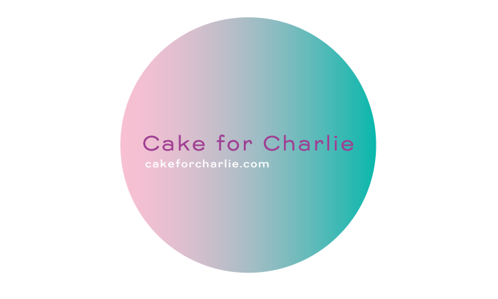
Cake for Charlie: Branding
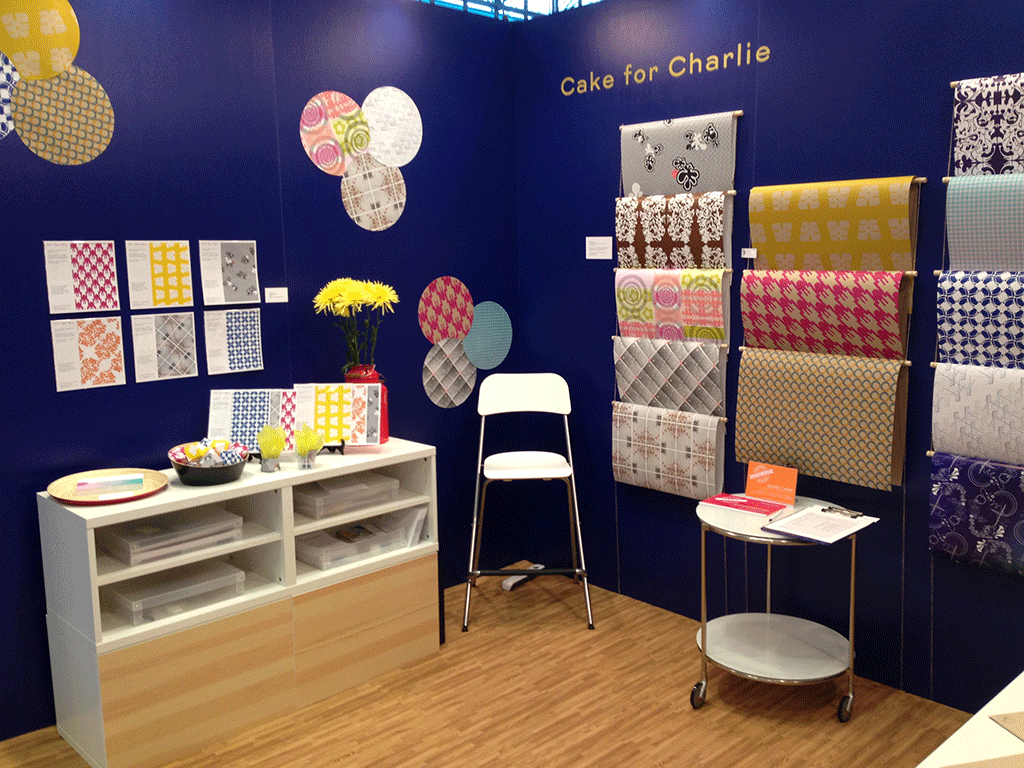
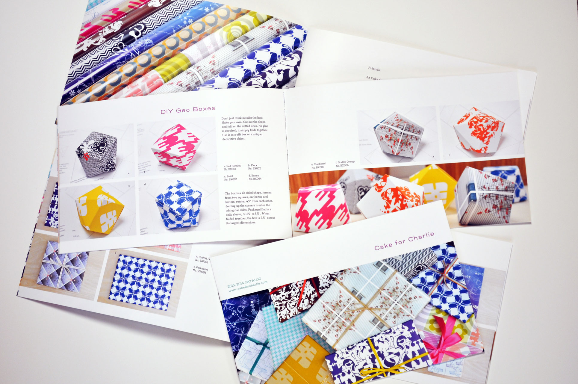
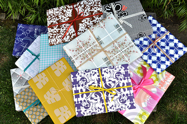
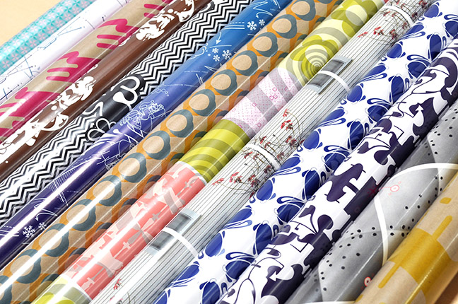
Cake for Charlie is a paper goods company that I started and ran for two years. We sold wrapping paper, note cards and geometric folding boxes. Our products were available at Los Angeles’ Museum of Contemporary Art’s (MOCA) gift shop as well as a handful of stores nationwide and several websites including Fab.com.
I used unusual design ingredients and derived my patterns from a variety of sources so they were rarely just decorative. I like to think of them as surface pattern design that went beneath the surface.
In 2013, I took my company to the National Stationery Show. Two of my wrapping paper patterns were selected as Best New Product Finalists.
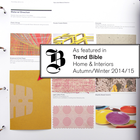
Trend Bible selected one of my patterns for inclusion in their 2014/2015 outlook. I was covered in the press by Uppercase magazine, DesignWorkLife, Country Living and TreeHugger.
I kept a daily blog of design inspiration and company news as well as employing social media to draw in customers.
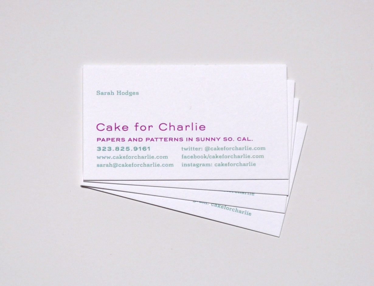
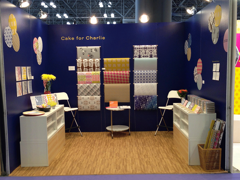
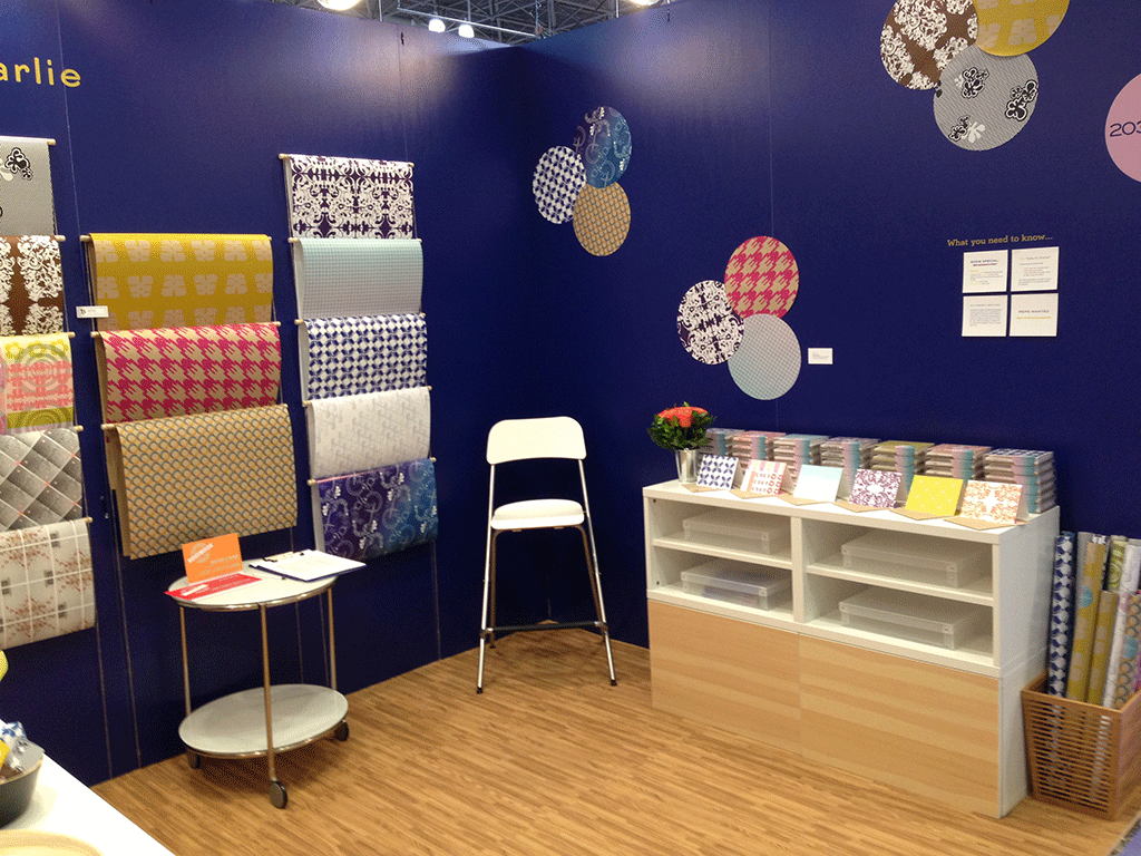
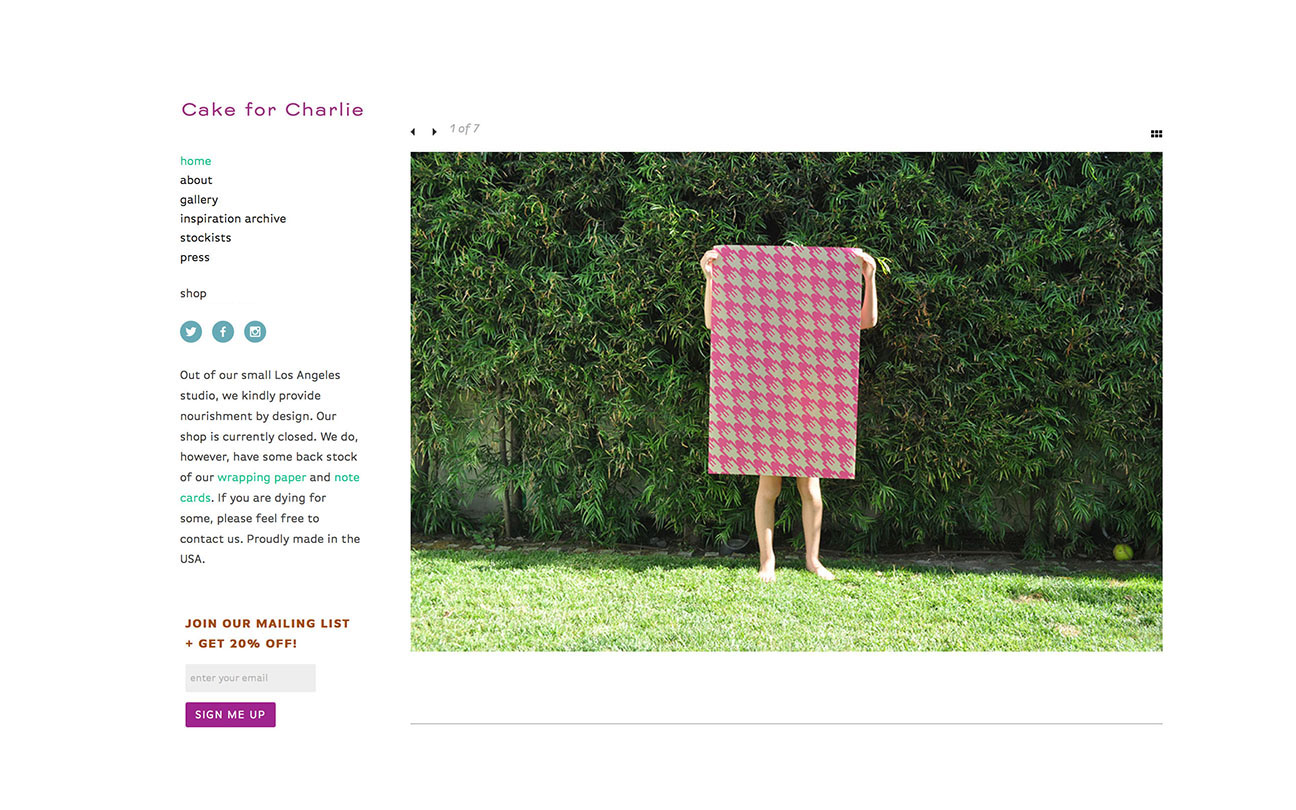
Shown here are my company logo, business card, tradeshow booth, product shots, catalog and website. All of the products we sold can be seen in the pattern section of this website. It was a great adventure and I learned mountains about starting up and running a small company.
Client: Cake for Charlie
© Cake for Charlie
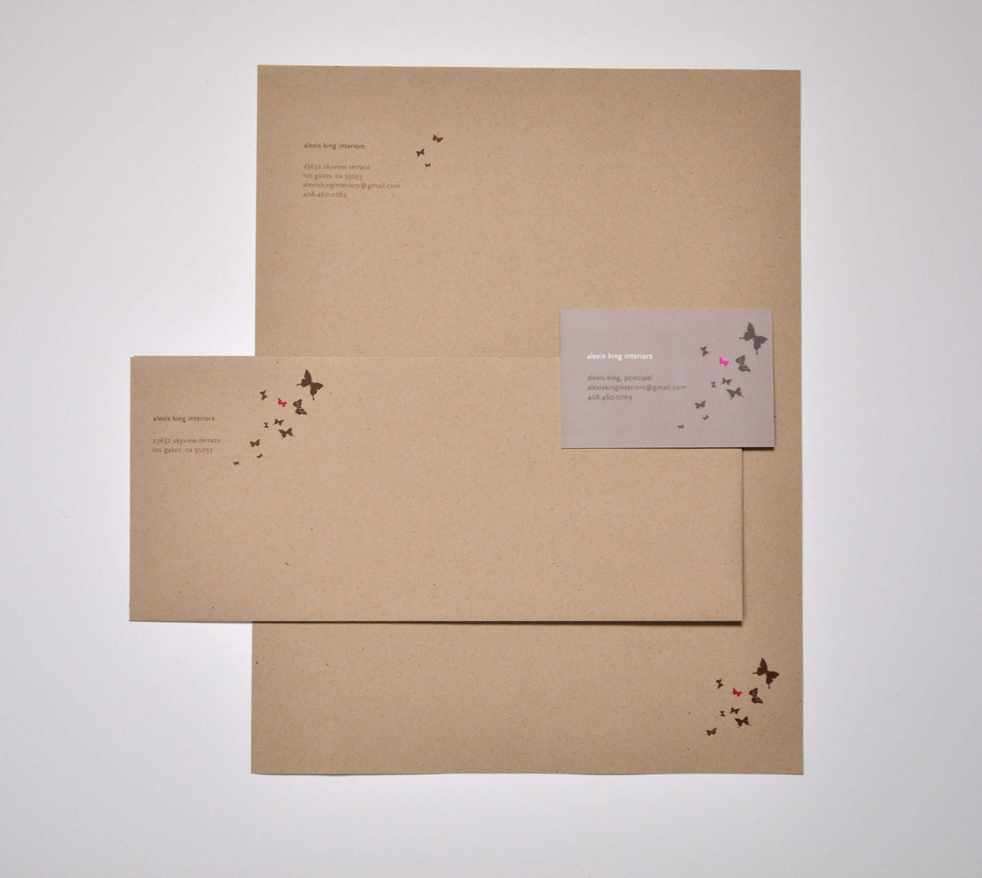
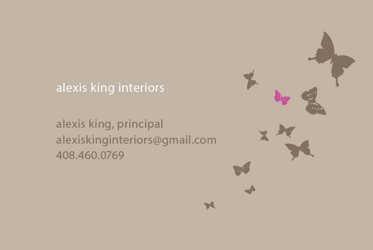
Alexis King Interiors: Identity
A letterhead and envelope design for interior designer, Alexis King. She suggested the kraft paper look and we went from there.
Client: Alexis King Interiors
© Alexis King Interiors
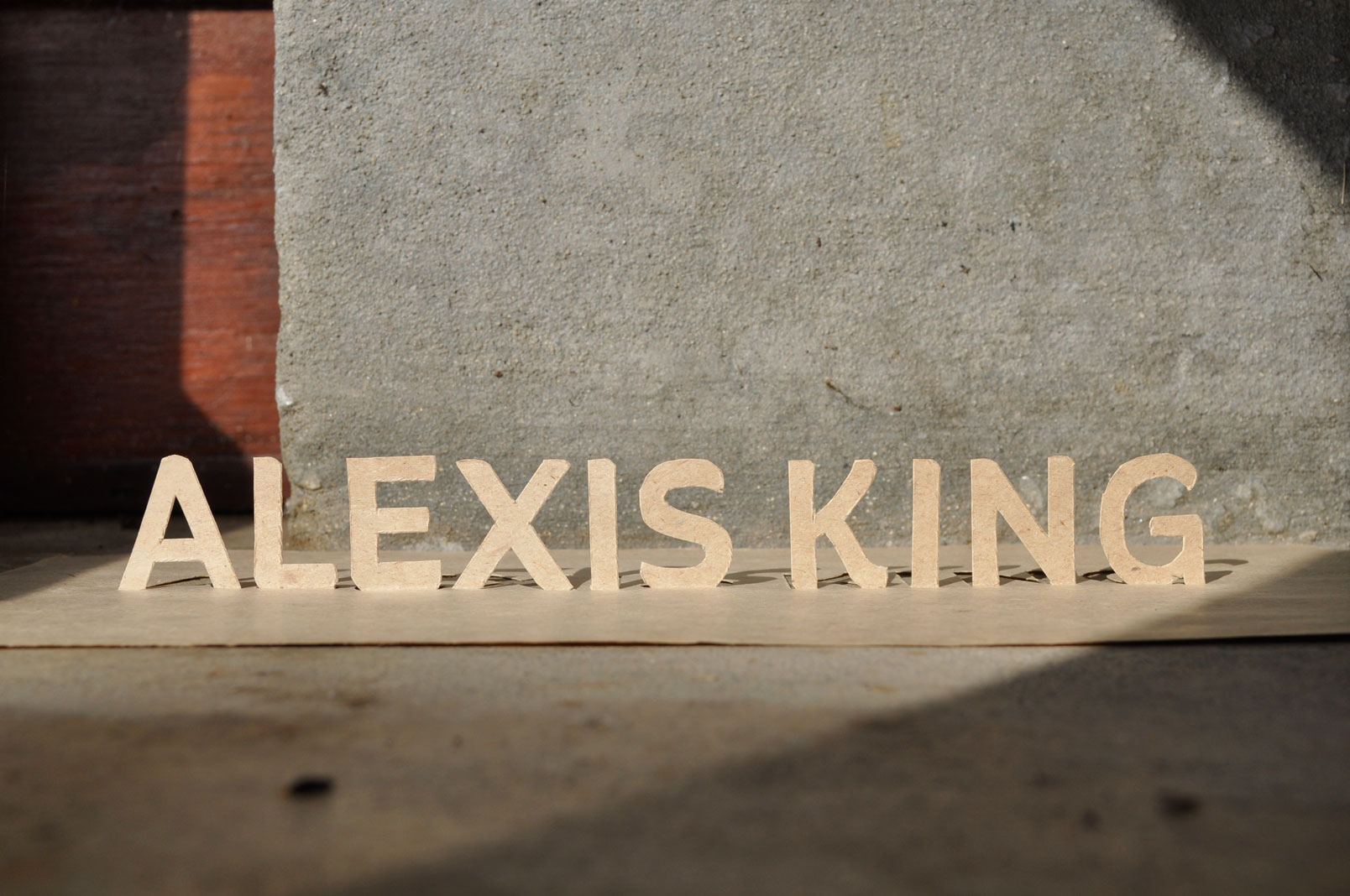
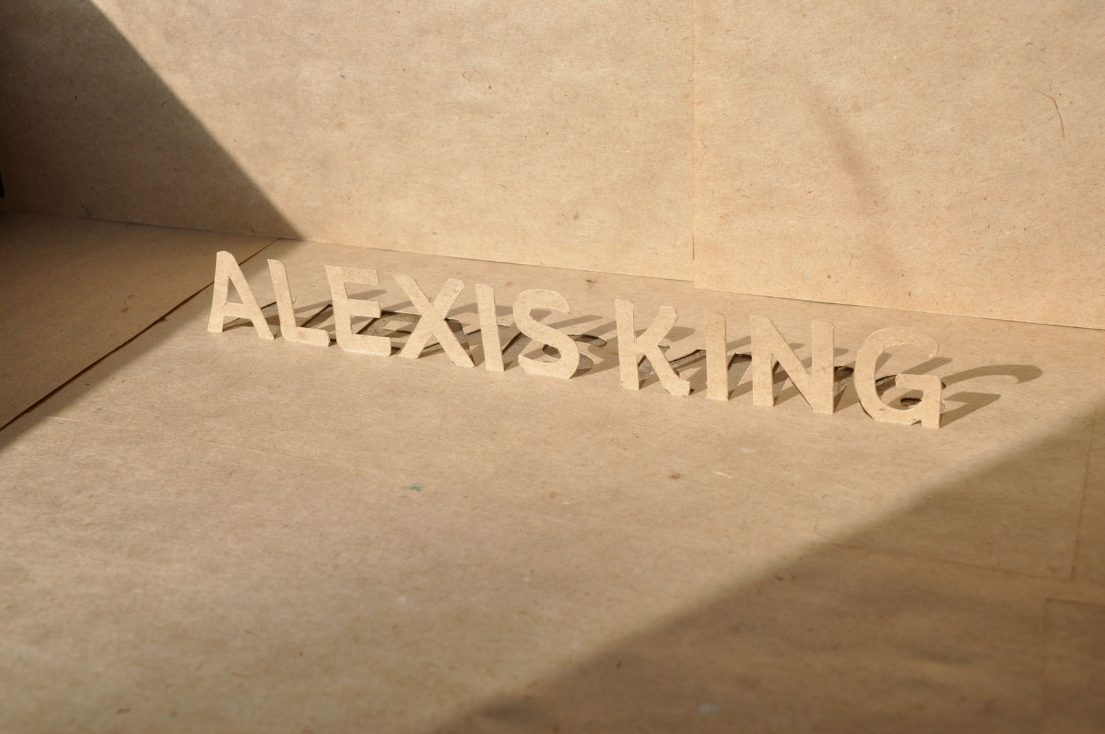
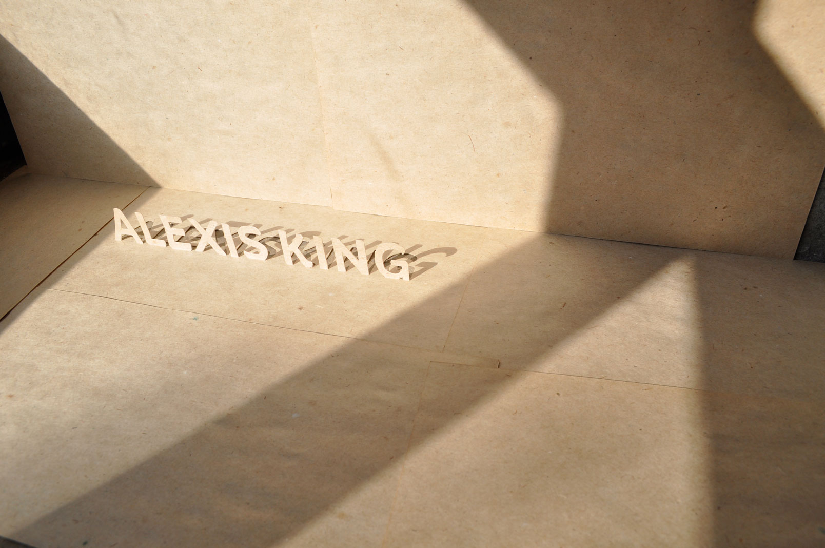
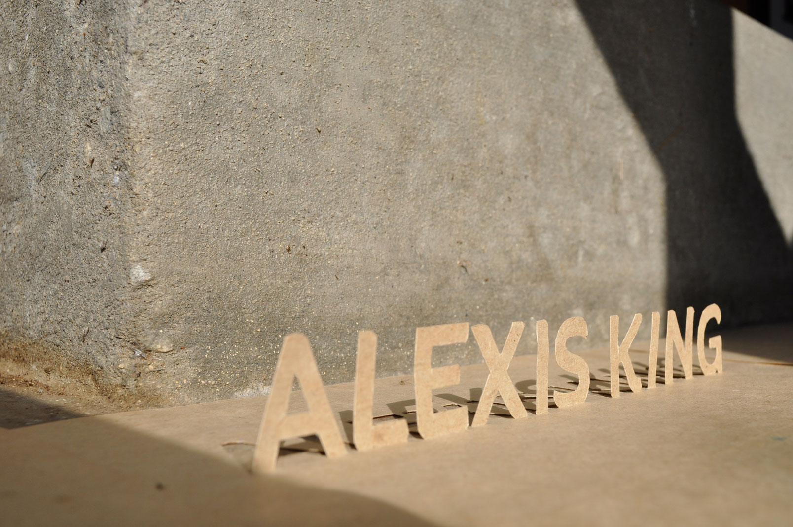
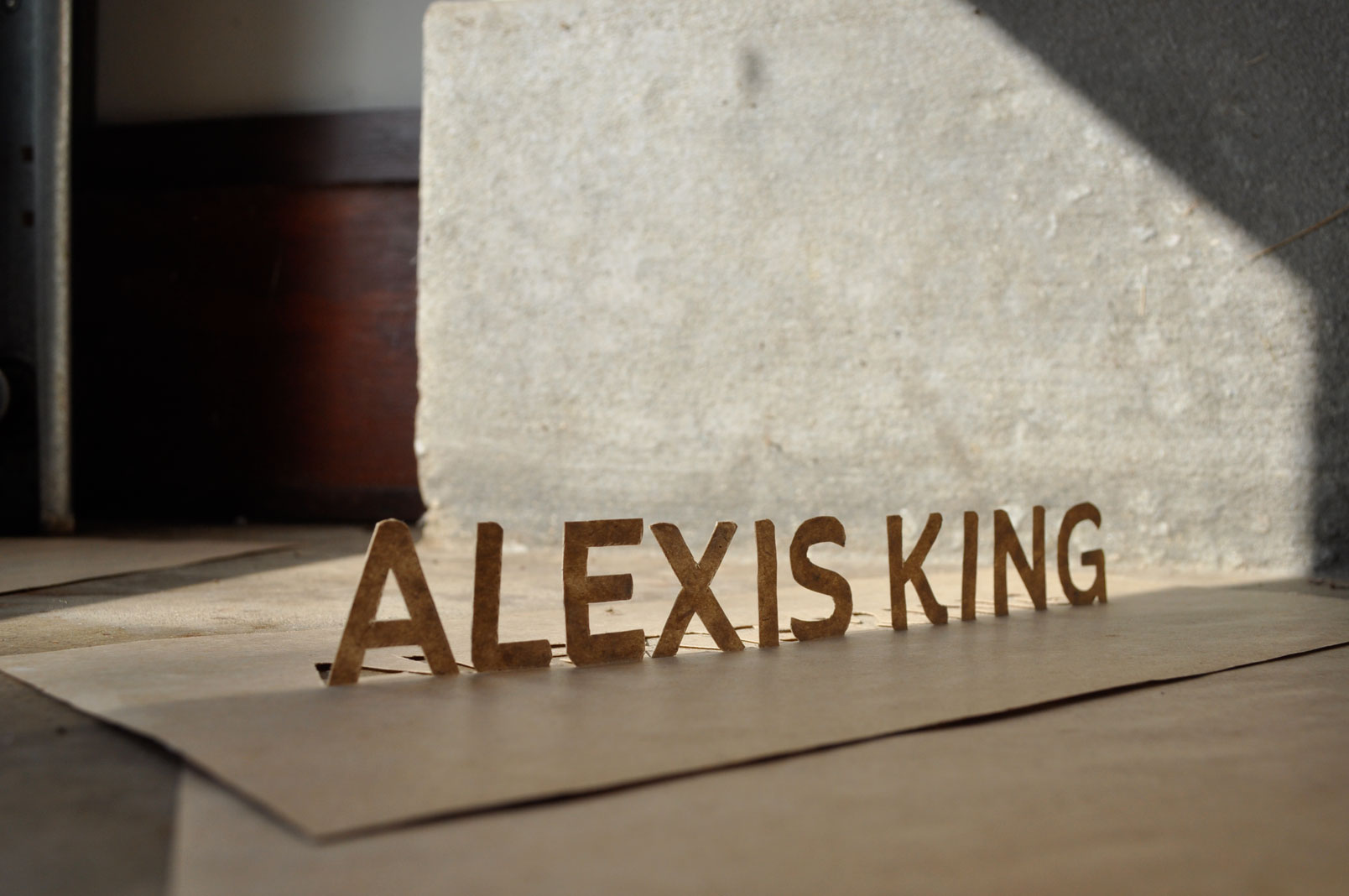
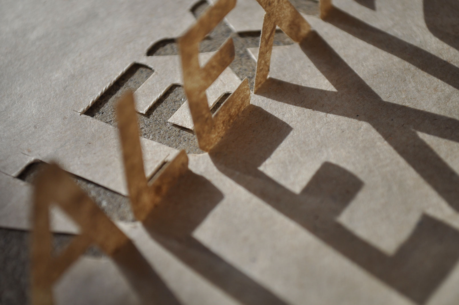
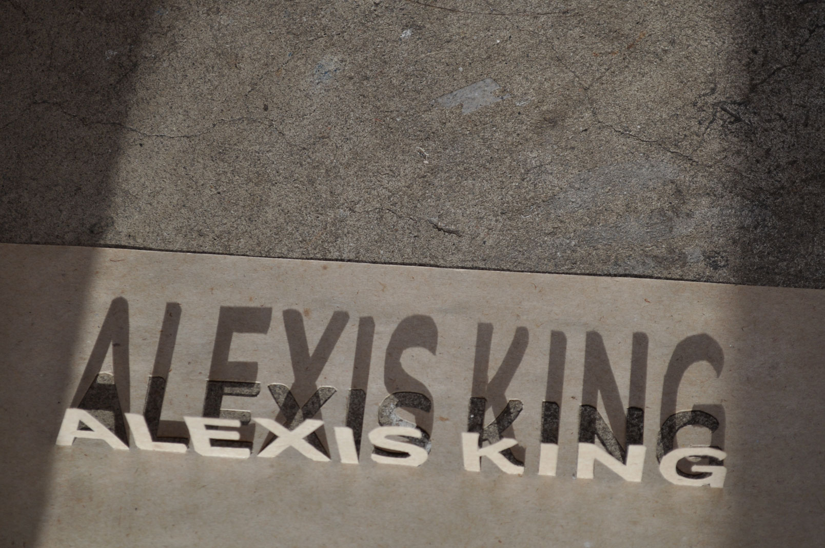
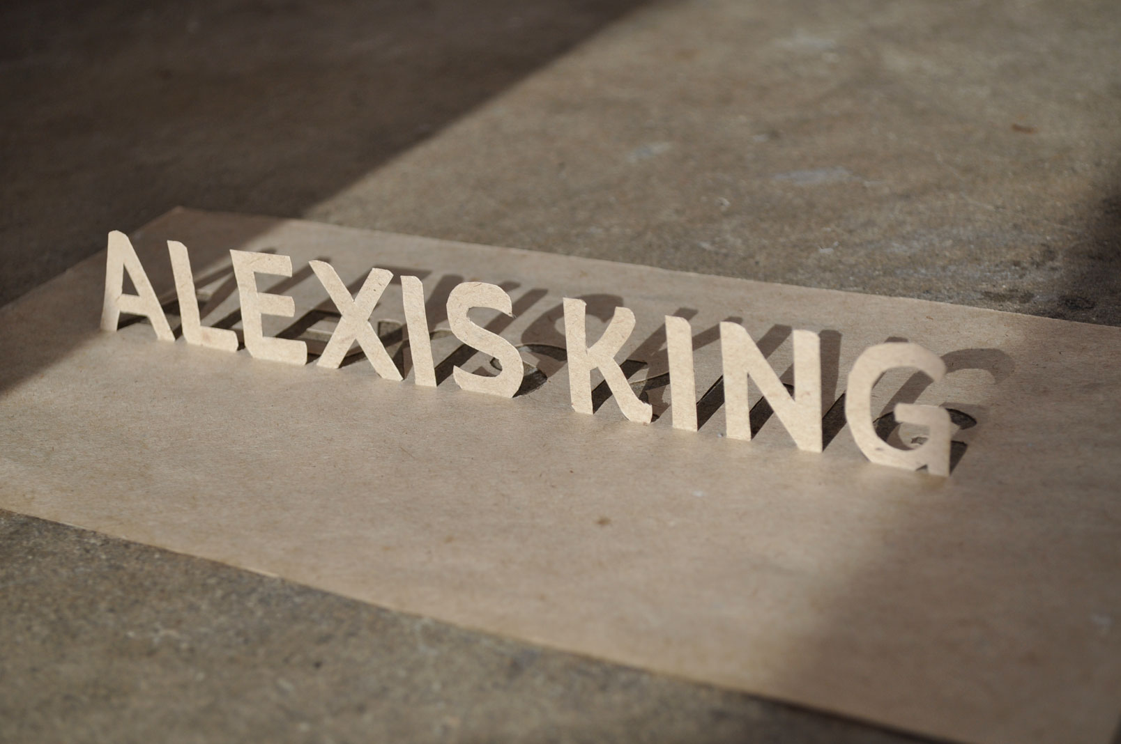
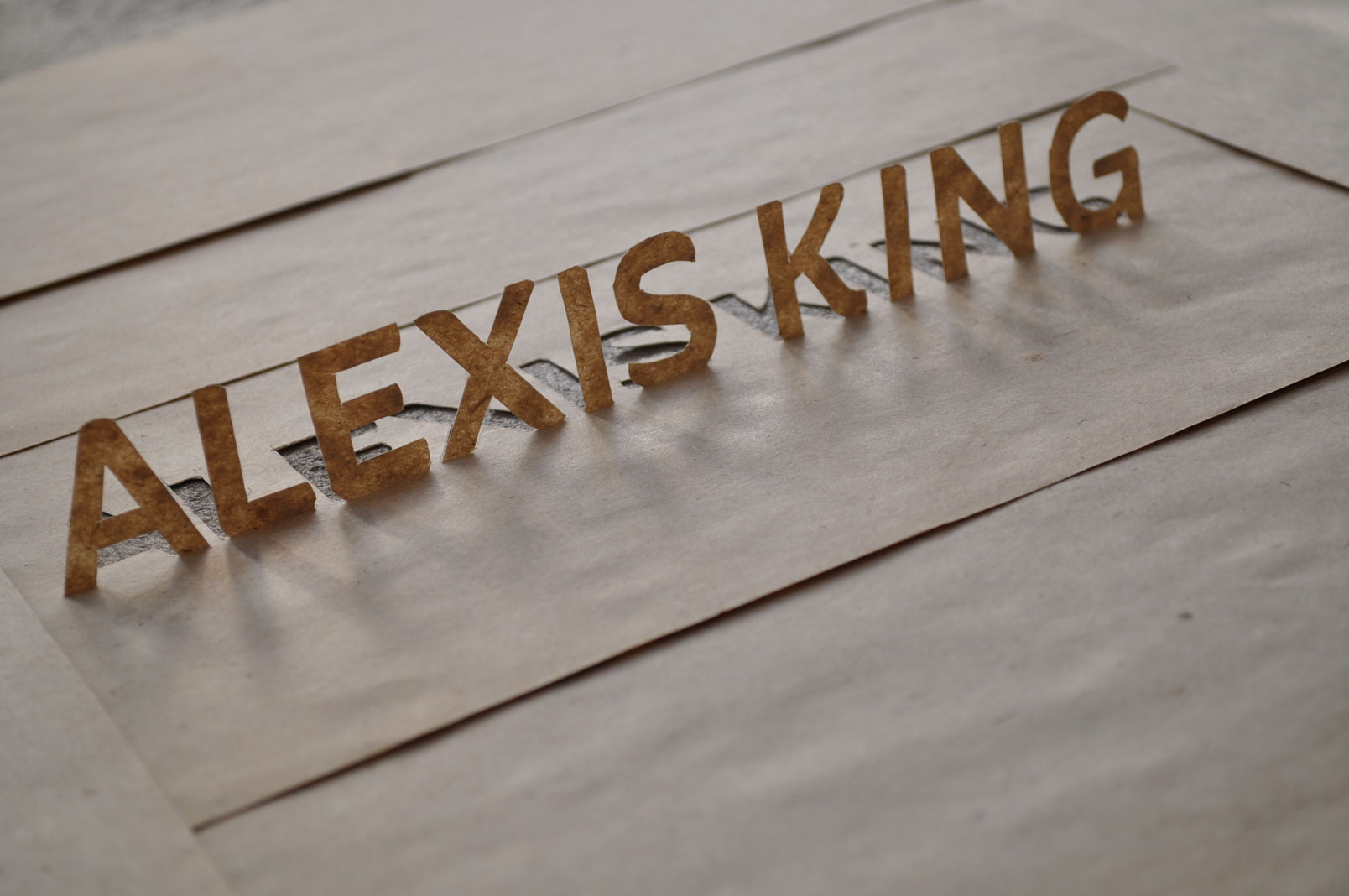
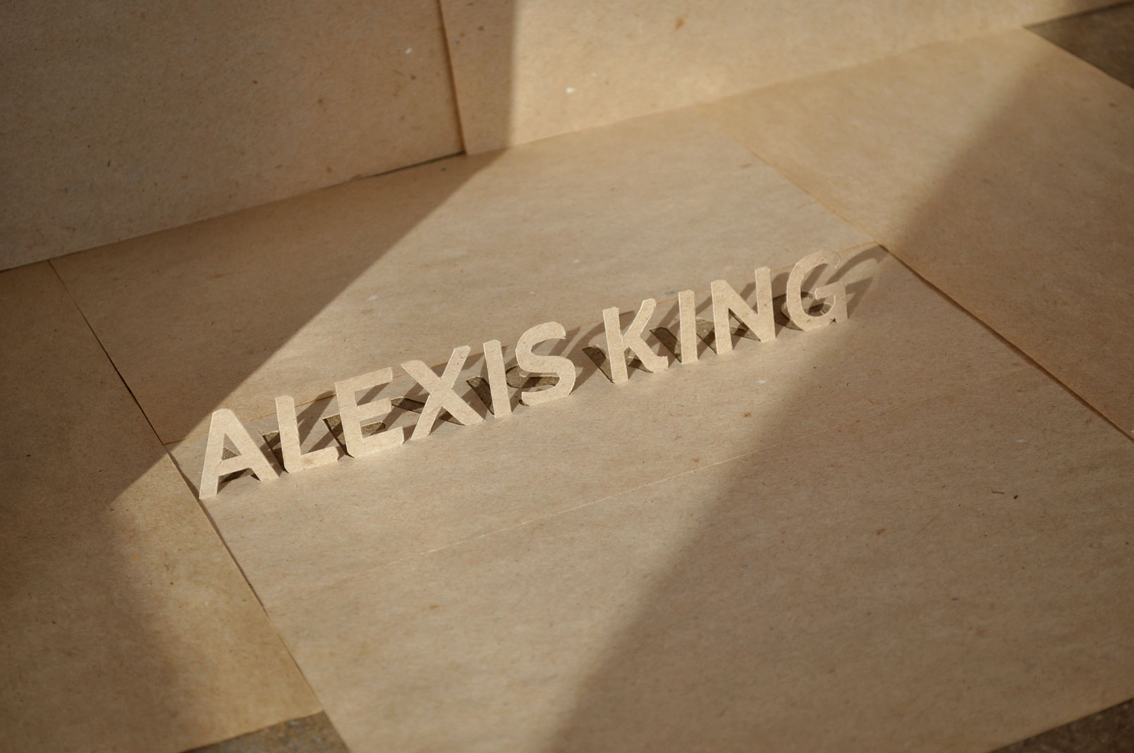
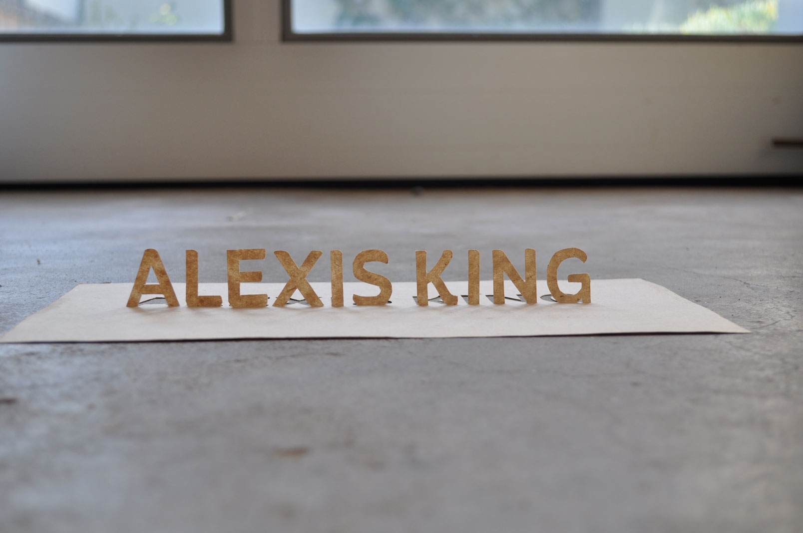
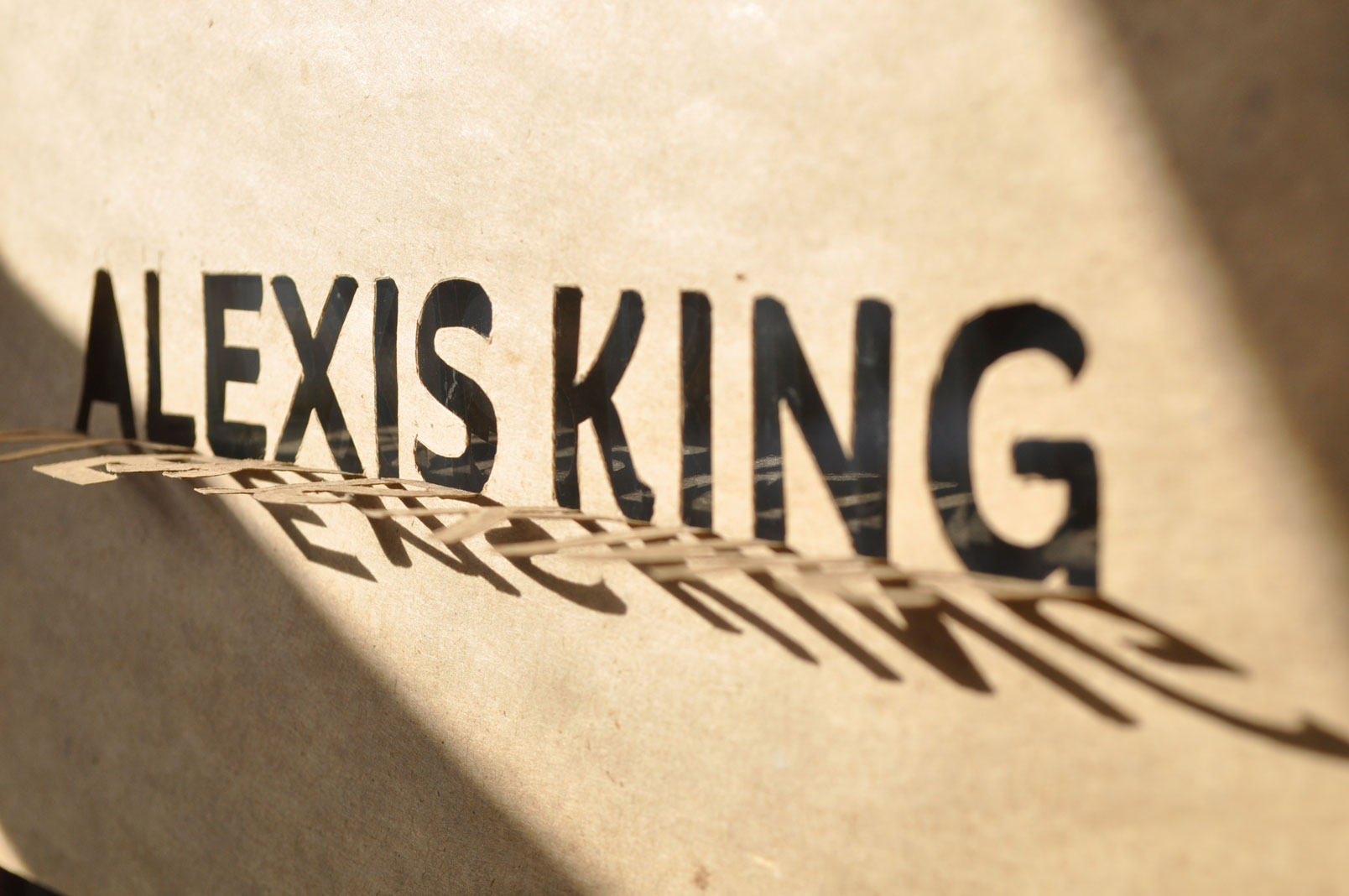
These are some photos of a direction we did not end up going in, but they are a good example of my exploratory process. I wanted to evoke my client’s use of natural materials and bare aesthetics as well as the three dimensional element of space that is her medium.
Client: Alexis King Interiors
© slh:studio
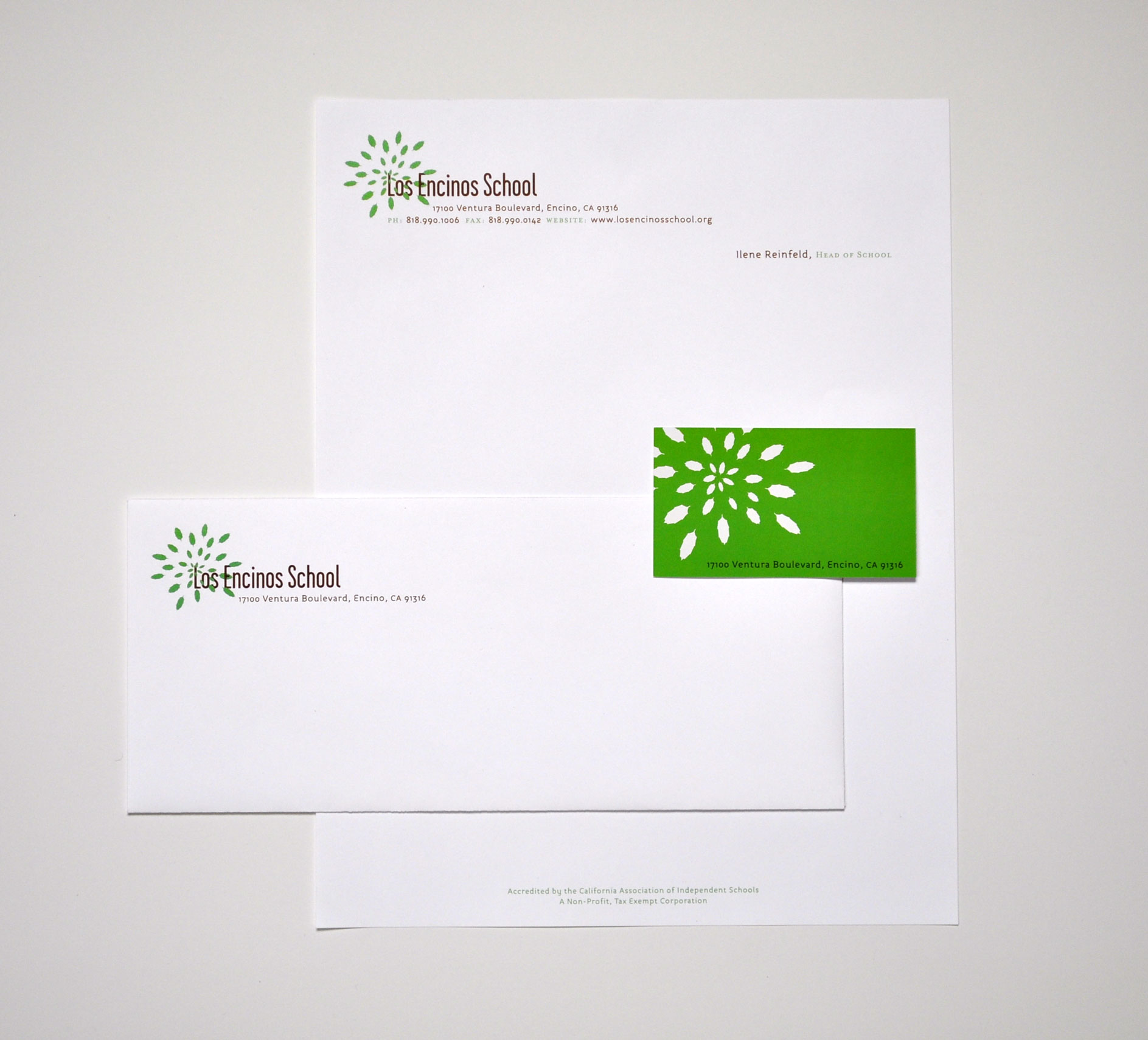
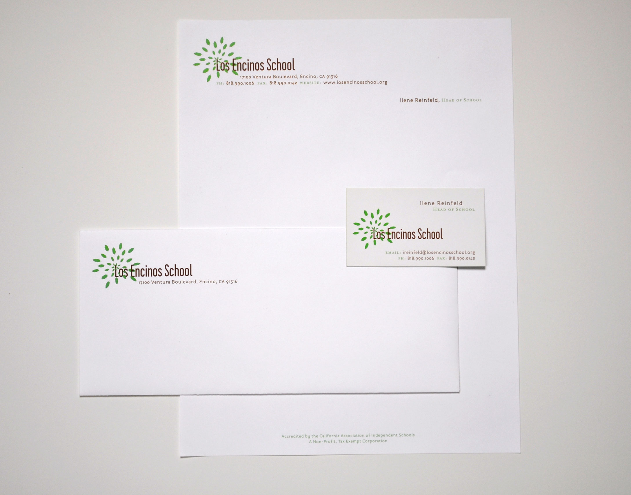
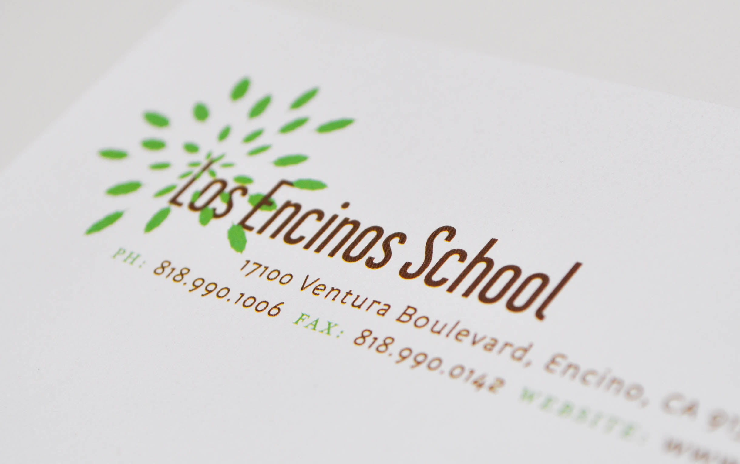
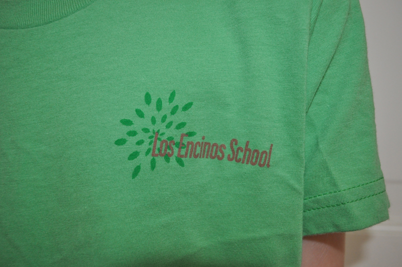
Los Encinos School: Identity
An identity for Los Encinos School, a K-6 elementary school in Los Angeles. It has been used on school communications, signage, building facades, hats, t-shirts, sweatshirts, socks, water bottles, flashlights, you name it.
Client: Los Encinos School
© los encinos school
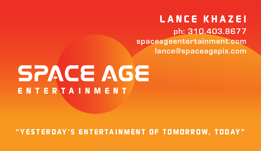
Space Age Entertainment: Identity
An identity for a production company. Business card and email signature are shown here. My client had a thing with the 70s NASA aesthetic so I customized the NASA typeface for the logo.
Client: Space Age Entertainment
© space age entertainment

![PFE bcard- front [Converted].png](https://images.squarespace-cdn.com/content/v1/51036015e4b0e8a2700a7652/1463435454445-RMLG12XFSK1JF3VGQ5GR/PFE+bcard-+front+%5BConverted%5D.png)
![PFE bcard-back [Converted].png](https://images.squarespace-cdn.com/content/v1/51036015e4b0e8a2700a7652/1463435461842-2RPSK9D9KYG4OMGDRGUL/PFE+bcard-back++%5BConverted%5D.png)

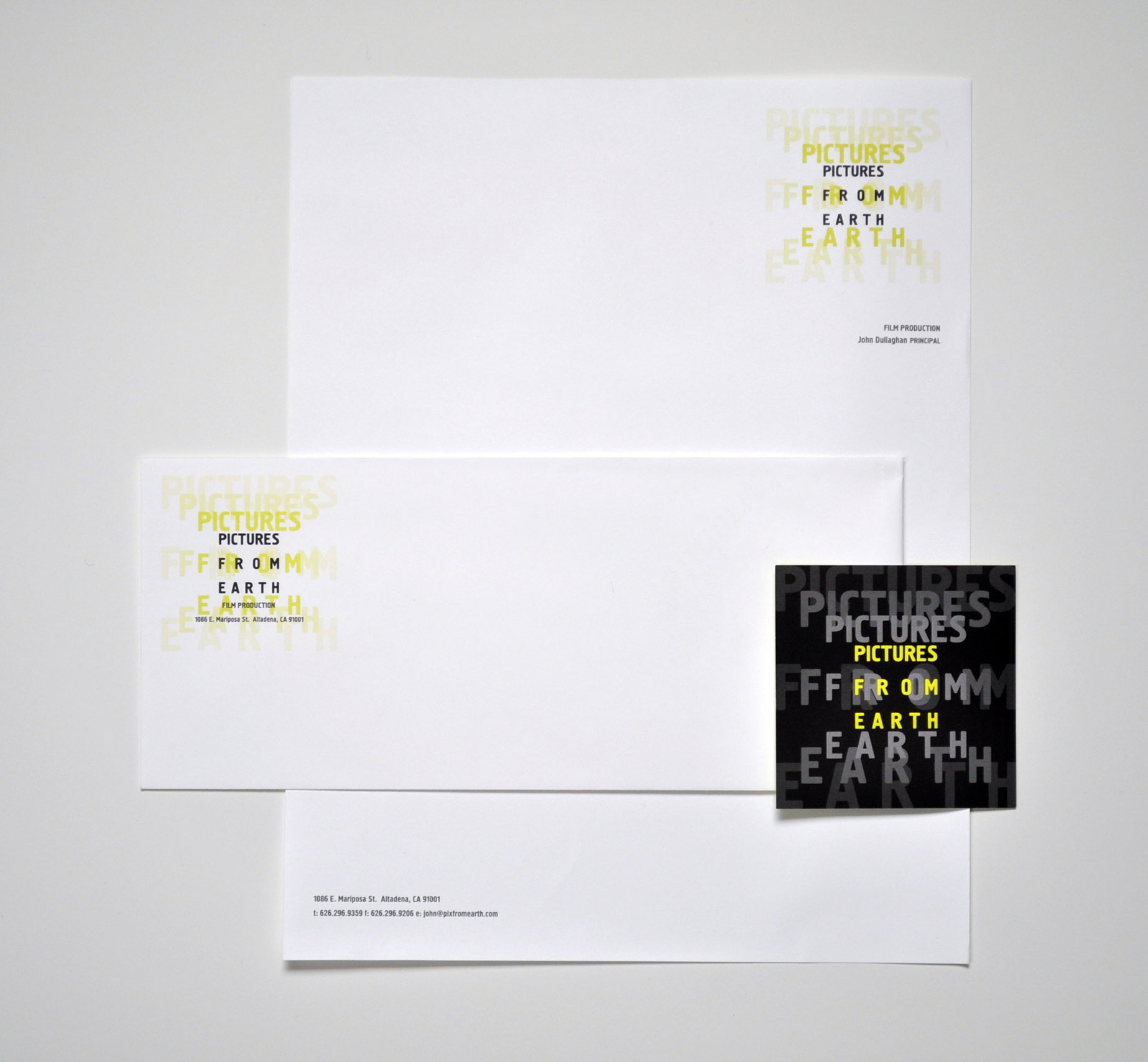
Pictures From Earth: Identity
An identity for a documentary production company. I was thinking about the Eames’ film, Powers of Ten, when I designed this.