
Viz For Social Good
VFSG is a social data project whose purpose is to empower mission-driven organizations and increase awareness of social issues through data viz.
Bridges to Prosperity
Bridges to Prosperity (B2P) works with isolated, rural communities all over the world to build trail bridges connecting villagers to essential services.
A key metric for the organization is the number of communities, and by extension, the number of people, served by each of its bridges. B2P surveyed travelers in Rwanda to understand the geographic reach of its trail bridges and asked VFSG volunteers for help in visualizing this data.
My entry was chosen as a finalist.
In all cases, click through to see the interactive versions.

Viz For Social Good Project
Project Roundup: Visualizing Internal Data
Since 2017, Viz for Social Good has reached 13 countries around the world, working in 13 sectors with 29 different organizations, drawing on the skills of 344 volunteer data visualizers hailing from 36 different countries.
Together, we have shed light on countless rows of data, uncovering insights that have made a deep impact in these communities. Seeing is believing!

Data Visualization Society Challenge
DVS 2020 Survey Data: Does This Job Ever Get Easier?
Do people have fewer frustrations in their data vis careers as they gain more experience? Or do the frustrations simply change?
Points compare the percentage of respondents with the corresponding years of data vis experience who have indicated a given frustration. Rows are ranked by the total numbers of responses.

A detail from the next section: each group of circles represents a frustration. As above, each circle shows the percentage of respondents with the corresponding years of data visualization experience who have indicated the given frustration.
Each is accompanied by a breakdown of the data literacy of the respondents’ audiences — low, moderate, and expert. Circle groups are ordered by the total number of responses.

Makeover Monday
Makeover Monday is a social data visualization project run by Andy Kreibel and Eva Murray. Working with a new dataset every week, it is a chance to participate in the community of others who are doing the same. It is mostly a community of Tableau users, but any tool is welcome. I used Tableau Public for these. Click through to see the interactive versions.
Airbnb: Berlin
While Tableau Public is frustratingly lacking in typographic tools, it does make it very easy to create maps.

Makeover Monday
Saving Rhinos
Creating a waffle chart like this in Tableau requires a scaffolding spreadsheet to create the cells that then get filled in with Xs. After a little googling, I ironed out the process and achieved what I wanted. I think SavetheRhino.org was very happy seeing all these vizzes on twitter.

Makeover Monday
Tolerance
This data set shows the increasing acceptance of same-sex sexual relations over the last fifty-ish years. I chose to make it exploratory so that you can click through the years and see the percentages in each age group growing.
The project required me to learn how to filter waffle charts. To accomplish this, I had to add all the years for each percentage row in the Excel waffle template so the data sets had something to blend on, link the year dimension from the original data set and finally, add a dashboard action to filter from the year to the various age groups. A helpful post I used to point me in the right direction is here.

Makeover Monday
The Sleep Gap
This data set from the American Time Use Survey at the Bureau of Labor Statistics revealed that women get more sleep than men.
Worth noting here is that the data reported sleep over 24-hour periods which included naps, dozing off and also time spent in bed tossing and turning.
* * *
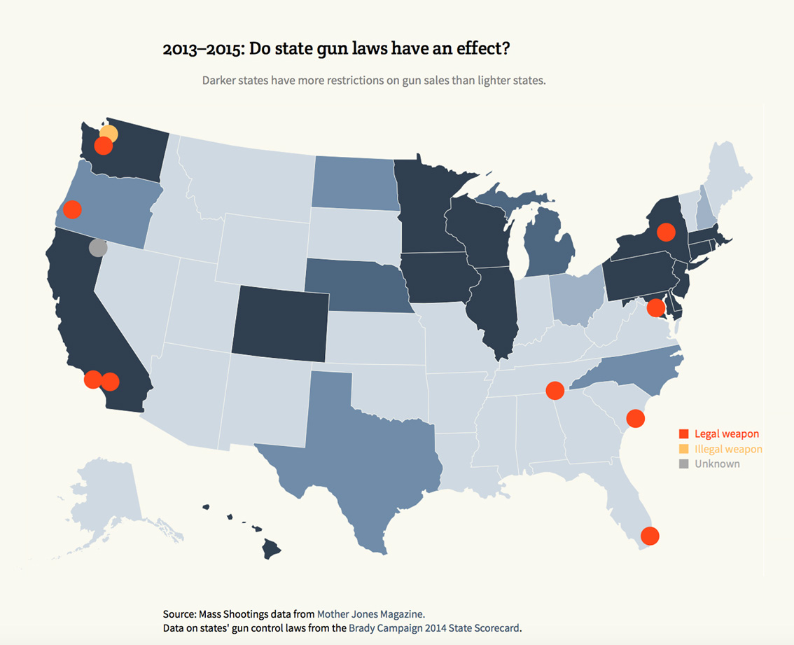
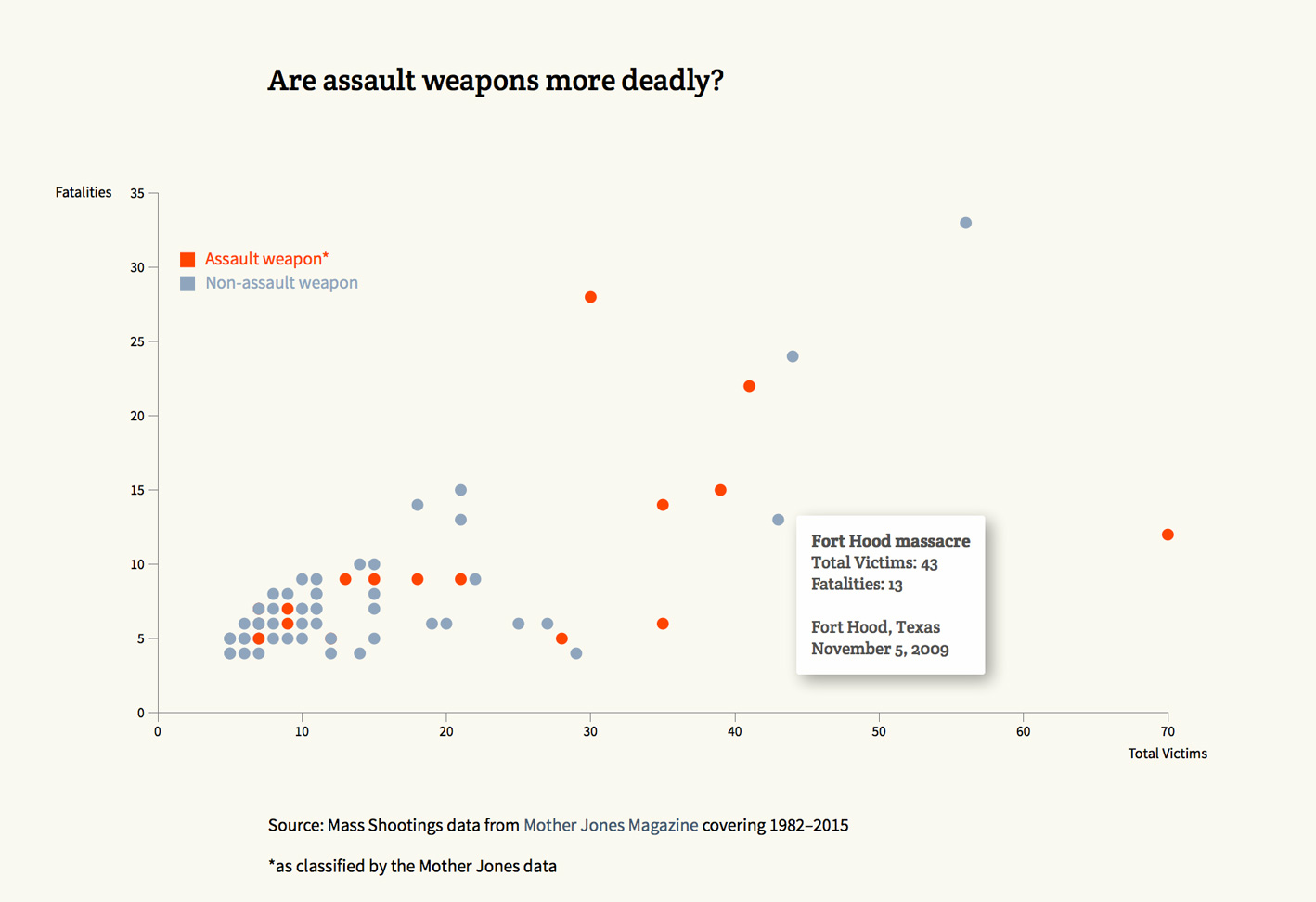
Broadly speaking, more mass shootings have occurred on the two coasts in more populated states than in the center of the country. While stricter state laws may have helped in some states, they have not deterred mass shooters from doing their damage in others. Guns can cross state lines with little difficulty and can be obtained by the wrong people even with state restrictions in place. Interestingly, it does not appear that states with fewer gun laws invite more violence. However, these states also comprise many of the less populous states which may play a factor. (For an amazing graphic and detailed analysis of gun traffickers, look at this.) As can be seen from the Virginia Tech shooting, an attack that was carried out with a gun not classified as an assault weapon, just as many victims and fatalities can result from bringing along a large number of smaller magazines. While there are many subtleties not included in this data, the solution of banning “assault weapons” and enacting gun control at the state level are not sufficient remedies.
[An important note about this dataset: it uses the FBI’s categorization of mass shootings, defining them as incidents that involve four or more fatalities. Other reports have included the number of crimes involving a gun or incidents that resulted in fewer than four fatalities and obviously, those sets of data reveal much higher numbers. And unfortunately, there is additional data to be added since I first made these.]
Personal Project
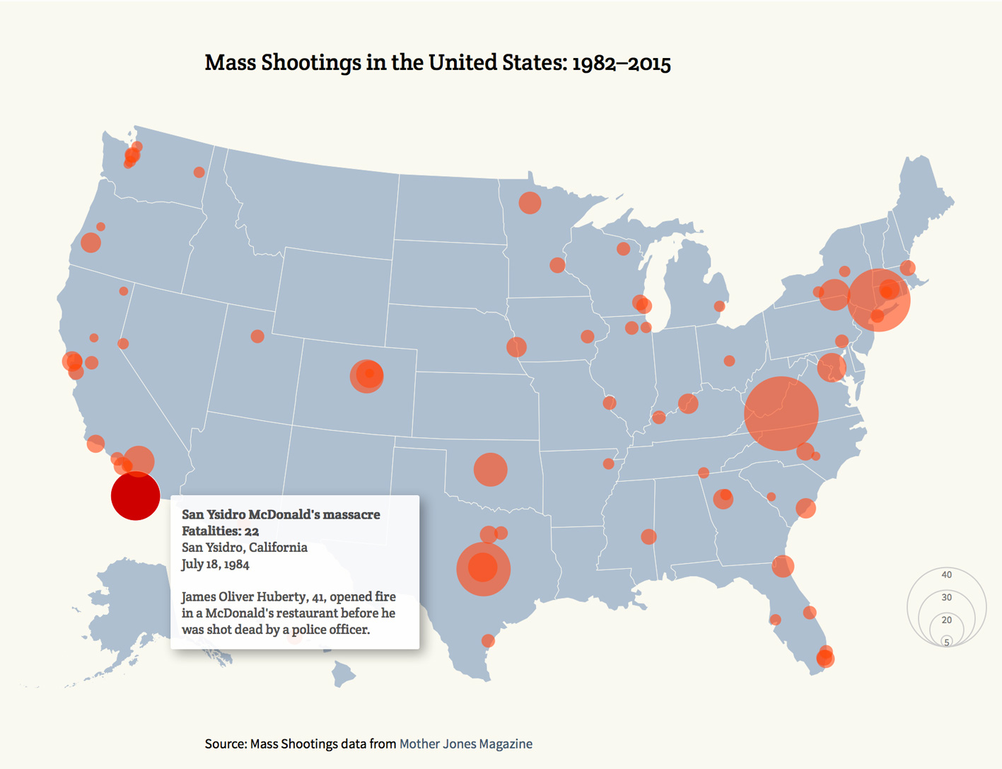
Mass Shootings in the U.S.
In researching this issue, there were some questions I wanted to answer: are mass shootings more common in some areas than others? Is gun control at the state level effective? Is conventional wisdom true that assault weapons are more damaging than other types of guns? Has the number of mass shootings been increasing or is that just my perception based on the media?
Using data compiled by Mother Jones magazine, I explored the numbers using d3 and came up with these visualizations. (Interactive versions are not currently available.)
The first map shows the location of incidents with the size of the dot reflecting the number of people killed. In the interactive version, hovering over each circle shows the details of each event.
The second map uses data only from the last two years of the dataset to more accurately reflect the effect of gun laws currently in place.
I was curious as to whether the mass shootings with the highest number of victims had involved assault weapons. It didn’t take much research to learn that the classification of assault weapons is a much debated issue. Some believe that the classification relies too heavily on cosmetic aspects of the gun and see them as no less deadly than guns not classified as assault weapons, arguing, for instance, that limiting the size of the magazine makes no difference. In the interactive verson, hovering over each circle shows the details of each event.
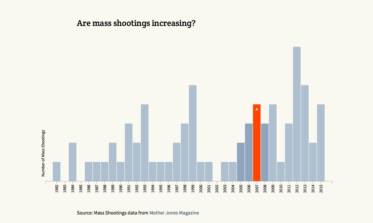
This graph is a straight forward visualization of the number of mass shooting since 1982. Not surprisingly, it shows an upward trend. In the interactive version, hovering over each bar gives the number of events. The bars display a darker grey after having been rolled over so you can see which ones you’ve seen already.